Brand new aesthetic
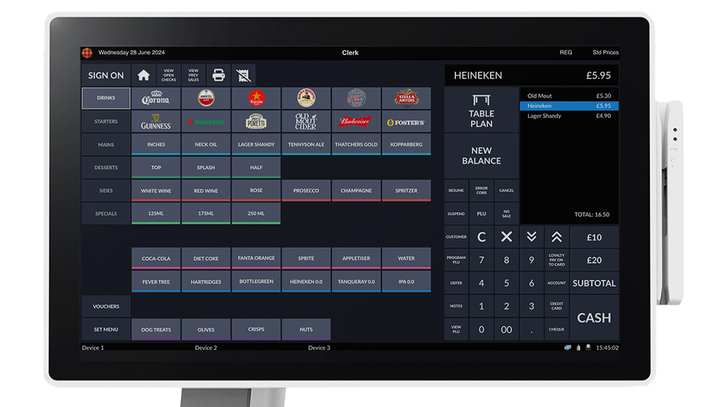
Our flagship software’s aesthetics have been reworked completely. The combination of improved image transparency handling and the new dark theme will provide an even more crisp and user friendly interface. The contemporary look was designed specifically to streamline user navigation and improve ease of use for an enhanced user experience.
Improved performance
As a team, it’s always our priority to continuously improve our software solutions and create industry-leading, user friendly software. Therefore, we’ve invested significant effort in improving TouchPoint’s system performance to provide a smoother experience for all. The optimised performance streamlines operations by reducing processing time, making TouchPoint more powerful and efficient than ever.
Intuitive iconography
The icons throughout the new design simplify interactions with intuitive visual cues that speak universally. The new intuitive iconography of TouchPoint allows a more aesthetic appeal; with greater customisation of the solution’s interface, user’s will be able to optimise space more efficiently. Icons and symbols are universally recognised, reducing the learning curve for new users, allowing them to quickly grasp and confidently use most features.
Improved button styling
We’ve enhanced the look of image styling on buttons, including transparency improvements. The new design offers a highly customisable contemporary interface, now with millions of text button variations. The keyboard programming function allows you to easily customise the buttons on your till to achieve desired functionality and style.
Compatible with the latest version of TouchPoint, this new-look upgrade will be available from June 2024, so contact your local Authorised ICRTouch Partner today to find out more!


